The Kardy identity
Made for the places we return to.Branding
Make it sticky.
A playful mark. A familiar feeling.Good things, kept close.
Our signature
Logotype & symbol
The expressive Kardy lettering and two-eyed card belong together. Friendly enough for a neighbourhood café. Distinct enough to spot at a glance.
Keep the original proportions, the horizontal lockup and the two eyes. Leave at least half the wordmark’s height as clear space. No stretching, redrawing or extra faces.
Logotype scale
Reference logo heights, scaled down to fit narrow screens. Keep the original aspect ratio at every size.
Colour with purpose
Core palette
Pink brings the warmth. Violet adds a little surprise. Burgundy does the talking, with white space giving everything room to breathe.
Use burgundy text on pink and violet—not white. Pink and violet are supporting fills, not small text on white. Keep functional screens neutral and error messages red.
Readable combinations
Contrast for normal-size text: AA requires 4.5:1; AAA requires 7:1. Use the passing combinations for readable copy.
Our voice, in type
Type system
The everyday voice: headlines, navigation, forms and body copy. Tight, bold headlines; comfortable, readable paragraphs.
Our expressive display face, shown in the outlined Kardy logo. The full font is not installed yet, so the editable preview below uses Inter. A licensed Lazy Dog webfont is needed to preview custom lettering.
Small, widely tracked utility labels distinguish Merchants, Rewards and Documentation without competing with the mark.
Keep good things close.
ABCDEFGHIJKLMNOPQRSTUVWXYZ
abcdefghijklmnopqrstuvwxyz
0123456789 & @ # ! ?
Type specimens
Good things, kept close.
A familiar face. A favourite place.
Give them a reason to return.
A little something, just for you.
Save your memberships, collect stamps and keep your favourite places close.
One family
Brand family
The same logo, followed by a quiet divider and a small label. Each part of the product stays recognisably Kardy.
Compact workspace headers also use the singular “Merchant” label. Merchant-owned business logos remain separate from Kardy’s identity.
Small, but unmistakable
App icons & favicons
The actual icon artwork used across the consumer app, merchant portal and documentation.

Consumer
Pink · #FF90C1
 Kardy
Kardy 



Gold is a documentation-specific identifier, not an additional core brand colour. At favicon size, use the card mascot rather than squeezing in the wordmark.
A little personality
Motion
A gentle hop, a blink, a soft landing—and a playful loading word. A small moment of character, without getting in the way.
The same loader used in the app. Reduced-motion preferences are respected.
Beyond the screen
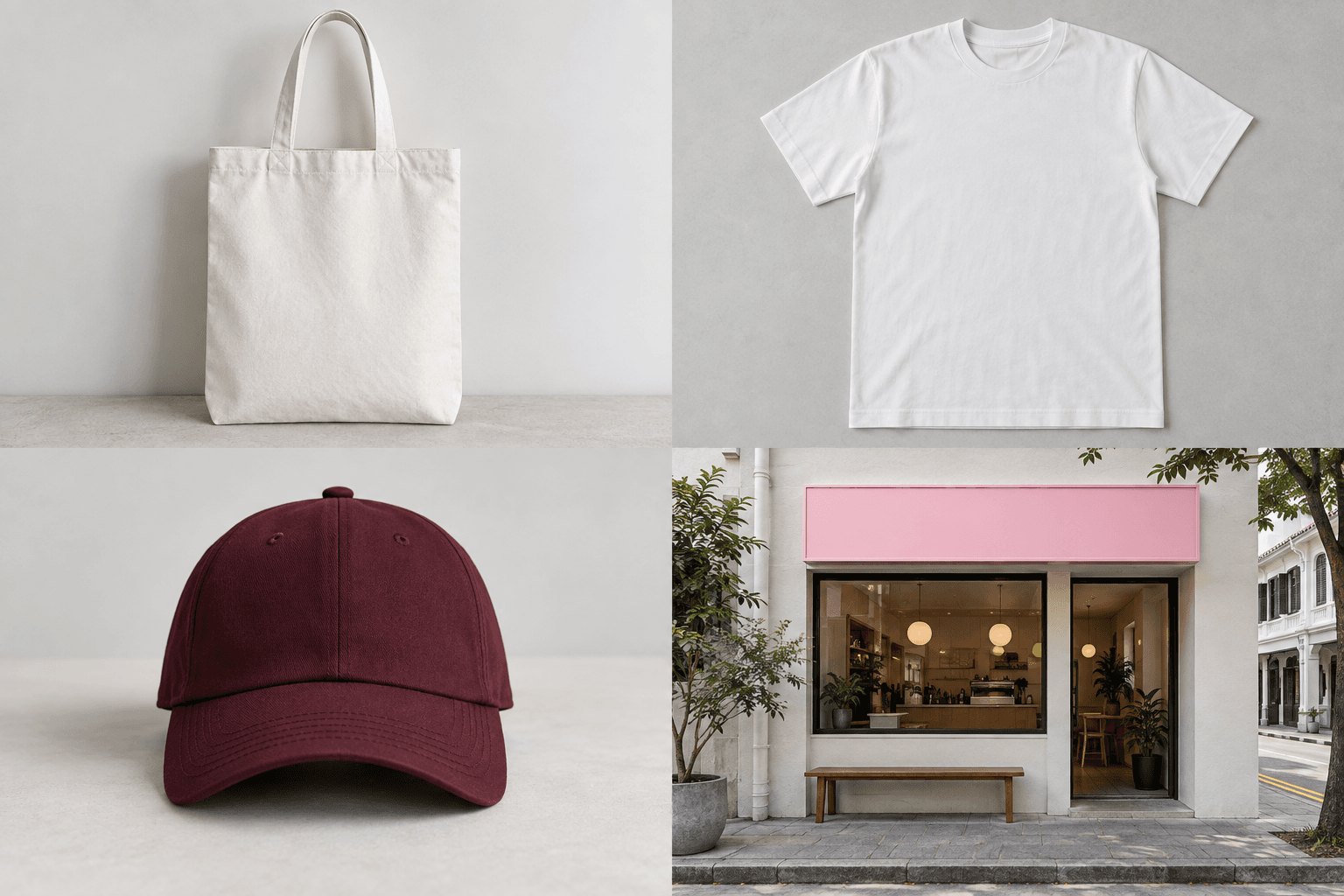
Out in the world.
An artist’s view of Kardy on things you carry, wear and walk past. AI-generated concept photography with the original vector artwork layered on top. Not merchandise for sale or an existing Kardy location.